OAC Girona

Share
The OAC Girona sits in the ground floor of an existing building. Being the central place of bureaucratic steps in Girona, it creates a clear, easy to use and srong image space. This is a plan set for better understanding of the project.

More information about this project and previous versions under the OAC tag http://raichdelrio.blogspot.com/search/label/oac%20girona
More information about us at
http://www.raichdelrio.com/


The furniture flows in the space defining it through strong force-lines.


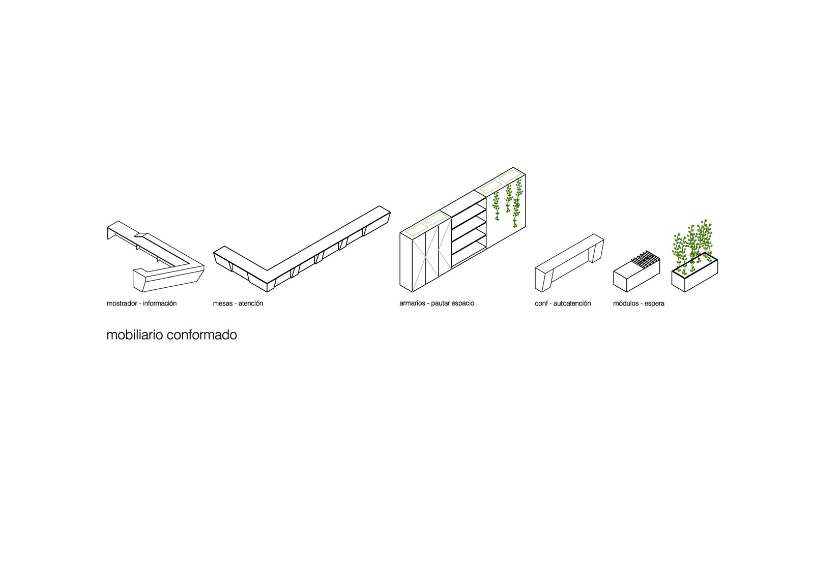
Several furniture typologies correspond to each of the functions: counters for reception-information, tables for bureucratic steps, closets to define spaces + support furniture for the waiting areas.

This elements combine in the typical section to create different uses:

Counters are facing street and always have a closet to give privacy. Tables work in a similar way: they face the waiting areas and also rely on counters to define the space.
Sitting areas are always in contact with windows and have the support of small designed furniture.
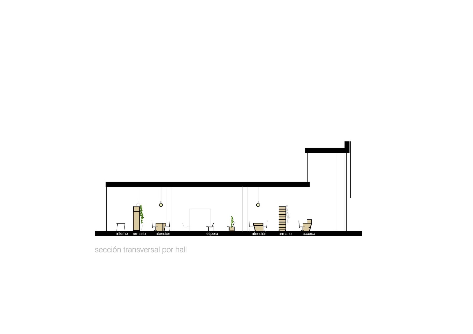
Cross section through entrance.

Typical entrance: to peak moments at your left (moments where office has a lot of movement: a new administration application or similar) or normal information at your right.

First attention level: fast steps.

Second attention level: more delicated steps.

Counters in space.

Tables in space.


Closets in space.


Waiting area desing furniture.


Online autoattention.


Standard furniture (tables + aero-benches).


Kids' space.

Example of table construction document.

Example of closet construction document.

More information about this project and previous versions under the OAC tag
http://raichdelrio.blogspot.com/search/label/oac%20girona
More information about us at
http://www.raichdelrio.com/

National Energy Museum

Share


In august 2010 we were invited by Feltrero to develop a competition for the permanent exhibition of National Energy Museum (MNE in Spanish). This weekend we got to know that we didn't win this phase. Taking advantage of it we publish it before the final result!
The competition was for 3 exhibitions of approx. 3.000 sqm each. Feltrero contacted with RdL arquitectos (http://www.rdlarquitectos.com/, we collaborated with them also in Dinopolis) to make 3 proposals with 3 teams, being RdR responsible of the exhibition explaining the consequences of the energy use. All museology was from Andres Clerici (http://www.this-is-public.com/about.html)
Here follows the information of our proposal before knowing who the winners are.

More information about us athttp://www.raichdelrio.com/


(image from http://www.skyscrapercity.com/showthread.php?t=736214)
The first thing we did was looking at the building: it's an abandoned centre of energy supply and our exhibition was in the building hosting the coal storage, in the upper floors. Watching images like this we immediately fell in love with the building and tried to make the exhibition according to it and always on it, never adding elements or hiding the building. And of course the "tolva" will be our leitmotiv.


Regarding the kind of exhibition we wanted to do, it was an exhibition that could benefit from the values of a science centre (activity, scientific rigour, several topics) and the values of a temporary exhibition (clarity of message, quietness in museographical resources, hierarchy of topics...)


We wanted to make the tolva the personal character and so each of the floors created a different relation to the tolva: through it, as opposition to it and on it. This clear idea will guide the entire exhibition (giving importance to the building, different scenarios and clarity, as the purpose was).


The next decision was to start from up to down: bringing people to the top and making them go down by gravity gave us a much more "natural" way of walking through the exhibition: first we would go through an immersion tunnel, then we would walk giving the back to it and concentrating in two new information walls and finally we would take advantage of the big space and lay in two stepped walls.


Looking at the sections we spotted different spaces and gave them importance with our structures: straight lines will show different highs in a very expressive way. Reading the content we spot 3 different topics: energy is more (from more advantage to more disadvantages), solutions to the problems (also in 3 subchapters) and the future solutions (a gallery of the future). So we put each of the topics with the relations and we got a very immersive entrance from more advantage to more disadvantages, then a two information bands for solutions and a chill-out agora for the discussion.


The upper floor, through the tolva: entrance at the lower right side with some totems where you can find your ecological footprint. At your left you would see the problems (climatic change and CO2 problems) and in the middle the immersion tunnel with the different topics, with individual projections in the left part (down in this plan) and group projections in the right part (up in this plan)

The middle floor, against the tolva: two walls relate to the tolva (old-new; no information - with information; straight - kinked) and hierarchies the information. This walls have interior spaces where needed to give deeper information and create different experiences without competition with the others. The floor touches two times to the tolva, moment where an inside view is created and in this balcony we put a metaphorical installation to show the carbon.


The down floor, on the tolva: to explain the future we imagined two linear walls, with kinks but this time instead of being vertical they are stepped because the visitor will not read the information but create it. These spaces make small agoras for discussions with on the latest topics of energy and have built-in screens to self-navigate on several topics or watch them projected on the tolva. A bigger plaza is created to make the gallery of the future, with the last research on energy use.


Diagrams:
-From more advantages to more disadvantages.
-Several topics in a kinked line, with deeper information.
-Several agoras and a superior meseta for the active discussion.
The initial totems.
Inmersion tunnel.
The carbon problems in interactive tables.
The kinked walls against the tolva.
An example of deeper information built in the wall.
The scenery representation of carbon.
The agoras with the built-in screens and the projections.
The future-plaza.

Renderings from sbda (http://sbda.cat/web/).
More Selected projects unde the __selection tag
http://raichdelrio.blogspot.com/search/label/__selection
More information about us at
http://www.raichdelrio.com/

Dinopolis - Teruel

Share


We got a new commision: doing a 3d + movement (4d) cinema in a theme park: Dinopolis.


The building is a prefabricated storage-like building and in one of the corners we have to build the cinema. The requirements are a que room, a pre-show with a projection, a projection room and the technical space.


After some trials we put the technical room inbetween the two spaces to acustically isolate them.


And after checking structural requirements we put the projection against technical room.


We didn't have any clue on what was going to be displayed in the rooms but we had to give them an ambience. We then decided to give them two very strong and different ambiences that didn't suit a content but create a story by themselves.


Pre-show will be a hard-mineral space and show will be a soft-vegetal space.


Of course everything will be "theme park" and artificial.


Que-room is a one-color box where only light from top and down creates the ambience (creates distance with the rest of the theme park and makes you want to enter)


Pre-show is a cave-like space that takes advantage of the double space in one of the sides.


Show is a vegetal space up until 2.20m and then a pladur space. Acustical and technical requirements are behind the fake-vegetal courtain, as long as air-conditioning and light. We expect AC to move the vegetation and create some nice shadow effects with the light behind.


We'll keep you informed!!!


More information about us at


OAC Girona

Share


PROJECT FOR THE CITIZEN ATTENTION OFFICE IN GIRONA:
Doing an attention model based on the suppression of barriers between worker and citizen.
Rethinking how to serve the citizen in all the fields: circulations, attention surfaces, computers, waiting areas...
Qualifying the working place and at the same time offering a citizen-friendly space.

OAC MODEL:
Facing the diversification of offices in the Generalitat de Catalunya (Catalan government), the model creates a strong unique image for all the offices.
This offices will have to seek for the citizen contact, calling it to participate in the interior and making its activity visible from the exterior always that it's possible.
It should also be a comfortable space, not impositive that the citizen can understand and appropriate of it easily.
Finally it should also avoid the classical separation in the offices between administration and citizen, proposing a common space where administration and citizen are part of a whole.

To solve all this requirements the offices are formalize in 3 conceptual axis:
-Unitary space: space will always be perceived in all his extension eliminating as maximum possible the barriers between citizen and administration (no glass or similar between them) and the jobs will be done in common surfaces (tables and counters)
-Understandable space: use categories (arrival, attention, internal work) related to different furniture (counters, special tables, standard tables) following strict shaping rules work in two different directions: distinguish uses and give a unitary image.
-Citizen seeking space: the offices take maximum profit of the street contact, putting the citizen in the windows. Besides, the elements will be placed with clarity to transmit the adequate image of the administration.

GIRONA PROJECT
We found a space where we couldn't touch walls, ceiling or floor, a uniform space cold in its formalization but with good spaces and great connection to the exterior.
Giving that and following the model we worked with 3 elements: counters in the entrance area, shaped tables for the working areas and the support of closets to create more comfortable spaces.
To give qualify the space we used vegetation and illumination. Vegetation is attached to closets (comes from up) in the working areas and to furniture in the waiting areas: with that we incorporated color and life in this cold space. Illumination helped us to create other light color spaces and "lowered" the ceiling in the attention areas to give a more intimate ambient.
Color code: The building has a very strict color code (white ceiling and floor, black or white walls) that we wanted to respect yet to bring it to the next step. The furniture goes from a strict white to grey, helping us to recognize the functions with it. Standard furniture (Aero bench and Castore light) where chosen for their abstract and clean lines. All materials are slightly shiny and very abstract to fit the building.
Construction system: all the furniture is lack MDF, constructed in workshop then mounted on site.


More information about this project and previous versions under the OAC tag
http://raichdelrio.blogspot.com/search/label/oac%20girona

More information about us at
http://www.raichdelrio.com/

The office sits in the corner of an existing building.

Office relates with high windows to the street.

Entrance is trhough a double space.

Counters make entrance-reception area and create circulations.

Counters, tables and closets create the spaces without touching the building.

Aero benches create waiting areas. Castore lights define each attention point.

Secondary attention is the corner space.

Closets qualify space in attention areas.

Waiting areas are allways related to vegetation and information points.

There is a kids space situated in the corner.

Attention in counters.

Attention in tables. Information is allways displayed for the citizen in a monitor facing its side.

Each worker has a defined space.

Waiting area in contact with the street. Vegetation is inside and outside.

Telematic attention points are situated in the office.

Closets are allways related to vegetation: one front for vegetation and the other for the doors.

The triple space of the stairs is colonized with a 5 bigger Castore lights in several levels.

The furniture extends to define spaces and create extra storing space.

Special furniture for institutional information.

The name of each worker is allways visible

Office for Citizen Attention.

All fotos from Santiago Garcés


More information about this project and previous versions under the OAC tag http://raichdelrio.blogspot.com/search/label/oac%20girona

More information about us at
http://www.raichdelrio.com/